
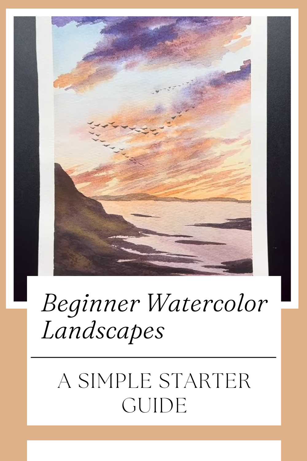
Beginner Watercolor Landscapes: A Simple Starter Guide
Ready to paint your first watercolor landscape without getting lost in complicated steps? This friendly guide pairs perfectly with a video tutorial by Art In Motion, helping you build confidence while keeping the process simple and enjoyable.
Instead of a strict recipe, you’ll find practical ideas that make the video easier to follow and your results more polished. Keep a curious mindset, a cup of clean water, and your favorite playlist—and let’s turn a blank page into a calm horizon.
Why Watercolor Landscapes Are Perfect for Starters
Landscapes are forgiving, expressive, and endlessly customizable. A sky can be dramatic or soft, a shoreline can curve or stretch, and distant hills can fade with just a touch more water.
That flexibility makes landscapes ideal for a beginner watercolor project—you’ll practice simple watercolor techniques like layered washes, soft gradients, and subtle textures while creating something you’ll be proud to show.
What You’ll Practice While You Watch
Color harmony: How warm and cool hues play together to suggest time of day.
Value control: Using light and dark to create depth and mood.
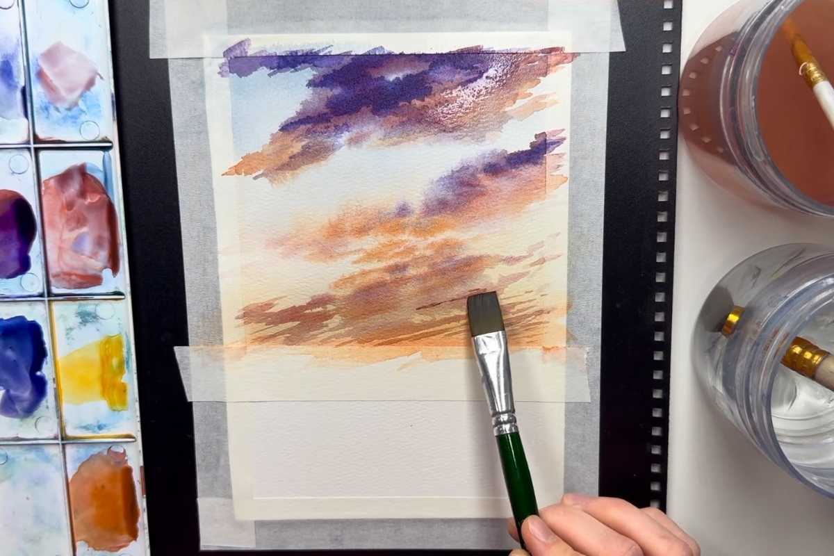
Wet-on-wet vs. wet-on-dry: Soft skies versus crisp silhouettes.
Layering (glazing): Building richness without overworking the paper.
A Clean Setup Sets You Free
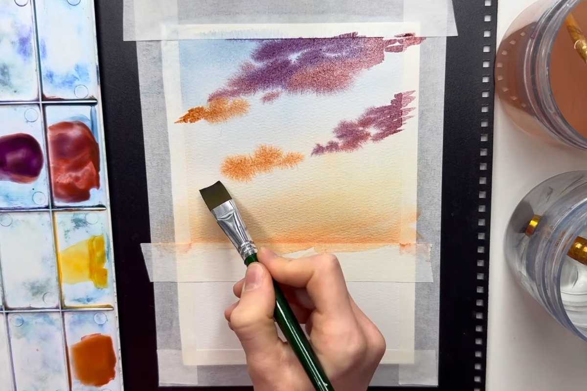
Before pressing play, tape your paper to a board to prevent warping and to frame your painting with a crisp border. Keep two water jars—one for rinsing, one for clean water—to avoid muddy mixes.
Arrange a modest palette: a warm and cool blue, a warm and cool red, a yellow, and a neutral like burnt umber or Payne’s gray. Limiting choices helps maintain fresh, luminous color and speeds up decision-making.
Brushes and Paper That Make Learning Easier
You don’t need a full studio. A medium round brush (size 6–10) covers skies and seas, while a small round is great for trees or tiny birds.
If you have a flat brush, it’s handy for broad washes and horizon lines. Aim for 100% cotton watercolor paper when possible; it buys you extra blending time and resists pilling—huge advantages when you’re still learning water control.
Building an Effective Composition
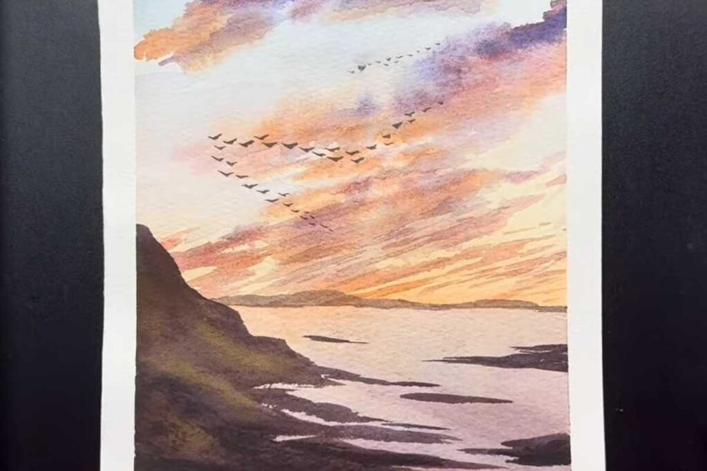
Think in big shapes first. Place your horizon slightly above or below the center to avoid a static feel. Use the rule of thirds to position focal elements—perhaps a silhouetted cliff, a cluster of rocks, or a band of reflected light across the water.
Keep the foreground darker and more detailed, and let the distance dissolve into lighter, cooler tones. This simple value plan instantly creates depth.
Color Choices That Suggest Time of Day
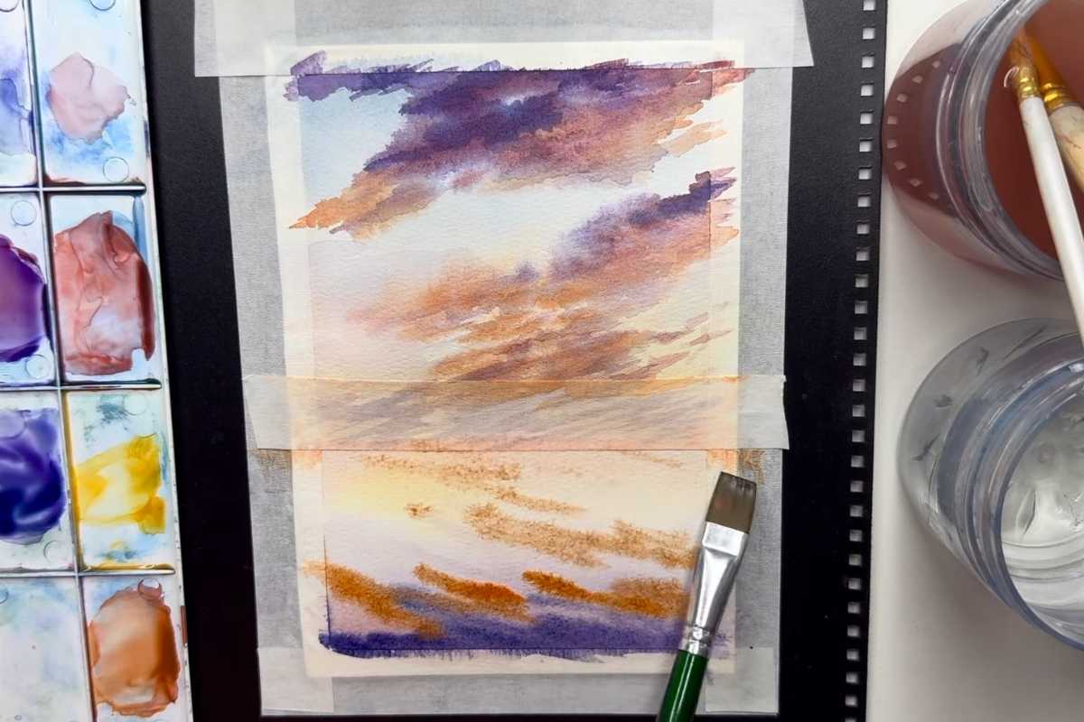
For a peaceful dawn or sunset, try a gradient that moves from warm peach and gold near the horizon to violet or ultramarine higher in the sky.
Keep your mixes watery and transparent; clean, transparent washes are the soul of watercolor. Let each layer dry before deepening colors—patient glazing prevents blossoms and dull, chalky passages.
Water, Reflections, and Edges
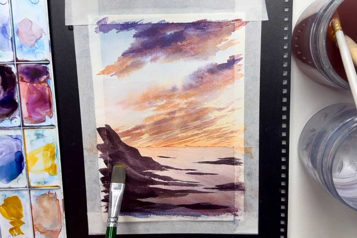
Water looks believable when horizontal strokes echo the sky’s color. Wherever light hits the surface, leave touches of white paper (your brightest highlights).
Vary edges—soft transitions for distant water, sharper shapes for rocks or shoreline. A few lost-and-found edges suggest atmosphere and keep the scene from feeling stiff.
Small Details, Big Payoff
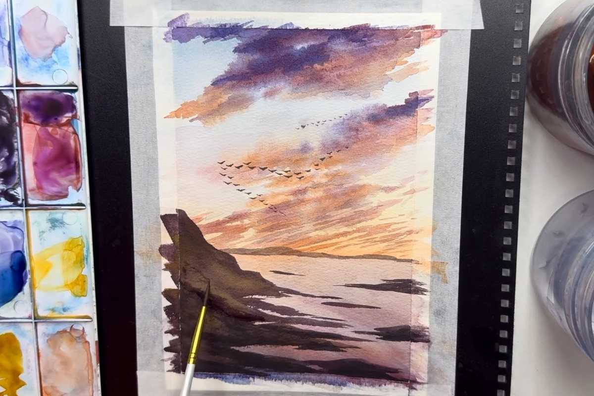
Add small accents only after the big shapes feel right. A hint of birds in the distance, a dark stroke for the shoreline, or a few textured marks on rocks can guide the eye.
Keep detail concentrated near your focal area and resist the urge to “decorate” everywhere. Less is often more—especially with watercolor.
Common Beginner Pitfalls—and Easy Fixes

Muddy color: Rinse your brush thoroughly and mix with fresh water.
Backruns/cauliflowers: Let layers dry fully before glazing; re-wet entire areas, not just parts.
Overworked paper: Step back, breathe, and add detail only where it supports the story.
Flat compositions: Recheck values—darker foregrounds and lighter distances create space.
Watch the Video and Paint Along
To see these ideas in action, follow the video tutorial by Art In Motion and pause where you need. The demo shows how to keep washes clean, place those dramatic cloud shapes, and anchor the scene with confident darks.
Beginner-friendly watercolor landscapes are about rhythm and restraint—broad, airy passages first, thoughtful accents last.
Final Encouragement
Your first landscape doesn’t need to be perfect to be beautiful and expressive. Celebrate the blooms, blooms you meant and the ones you didn’t. Each painting builds your eye for value, color, and composition.
Press play, keep your washes light, and enjoy the process—your next horizon is already waiting on the page.
We thank Art In Motion for the images.
Enjoy The Video Tutorial

Source: Art In Motion
Did you find this post useful or inspiring? Save THIS PIN to your Art Board on Pinterest!
Last update on 2026-01-14 / Affiliate links / Images from Amazon Product Advertising API
Discover More Artistic Inspiration