
Easy Watercolor Landscape Tutorial for Absolute Beginners
Few mediums feel as fresh and expressive as watercolor. With just paper, a brush, and a small travel palette, you can suggest towering peaks, drifting clouds, and quiet forests in minutes.
This post accompanies a beginner-friendly watercolor landscape tutorial by Art In Motion, highlighting the key ideas you’ll practice on camera without rehashing the steps.
Think of it as your guide to the “why” behind each move so you can paint with confidence and enjoy the flow.
What you’ll learn from the video

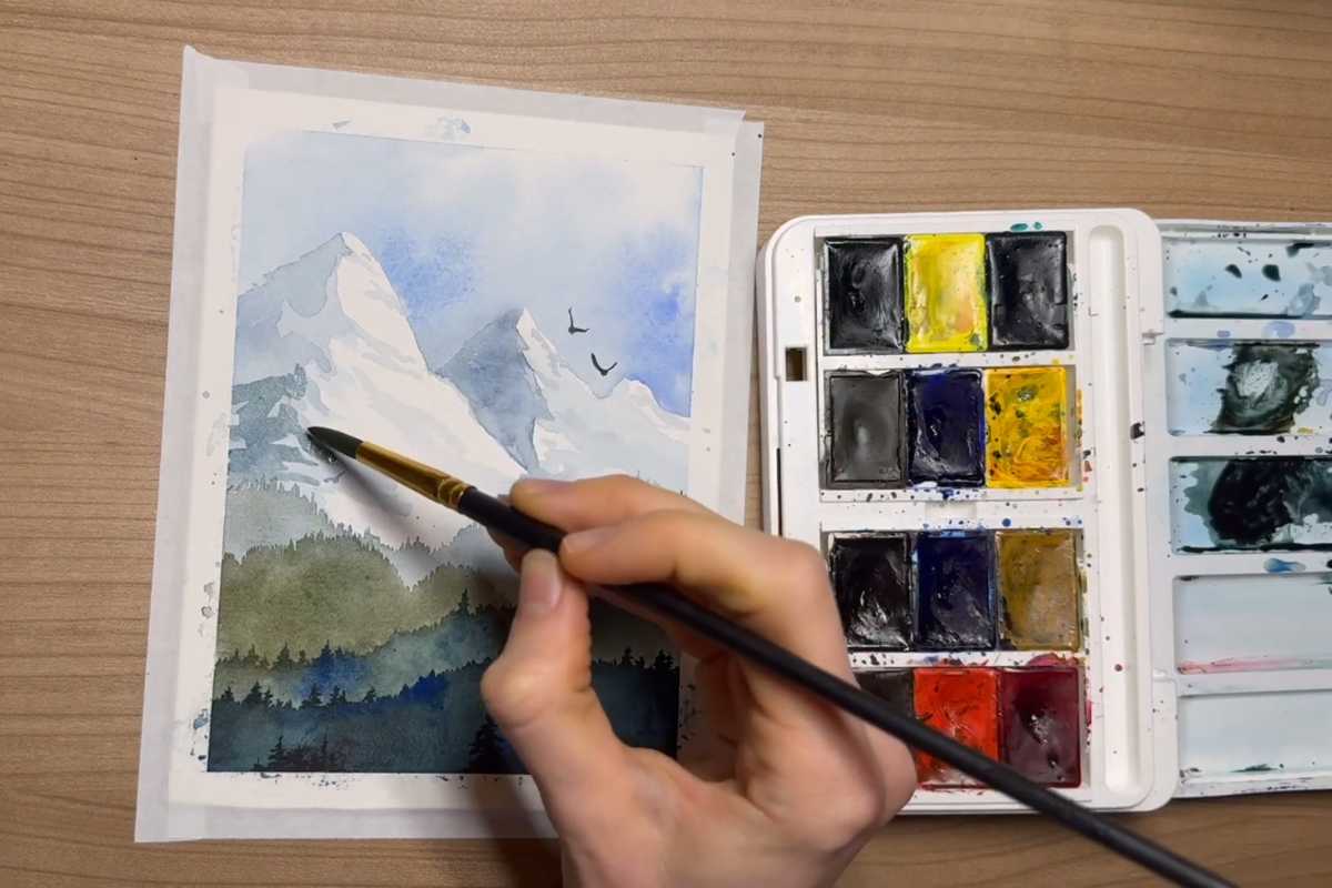
The lesson focuses on building depth with transparent layers, balancing soft atmospheric washes with sharp, graphic silhouettes, and choosing a palette that captures mood.
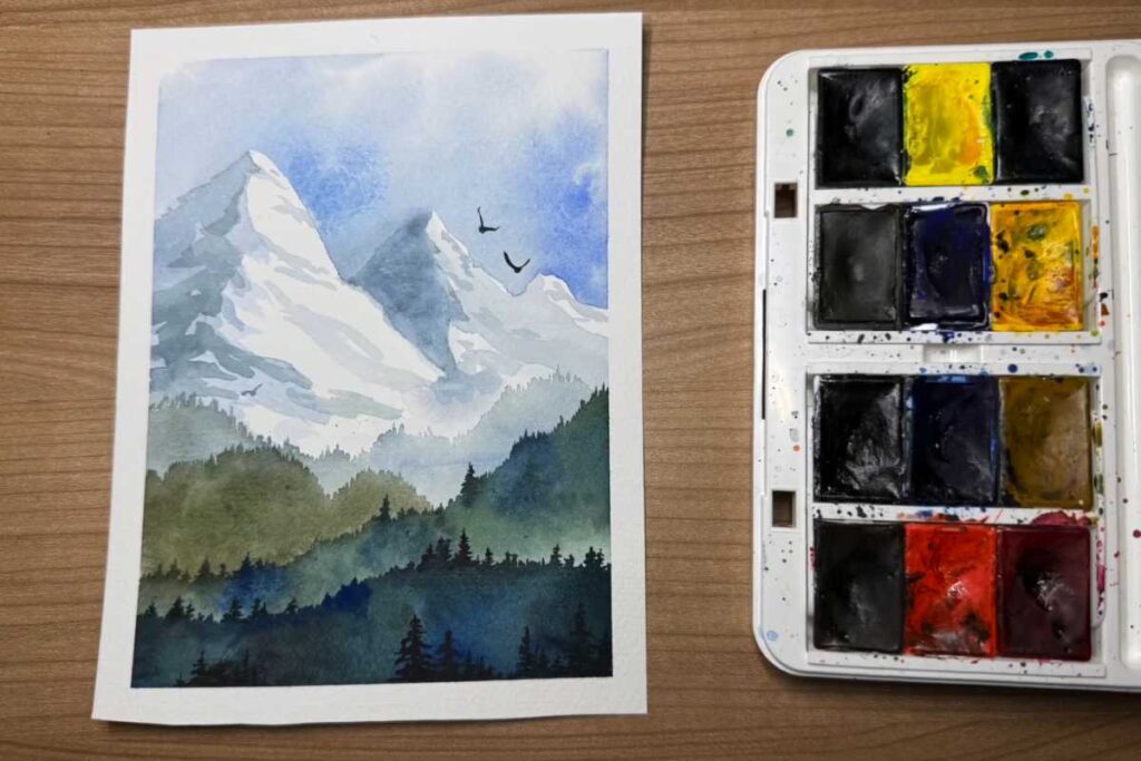
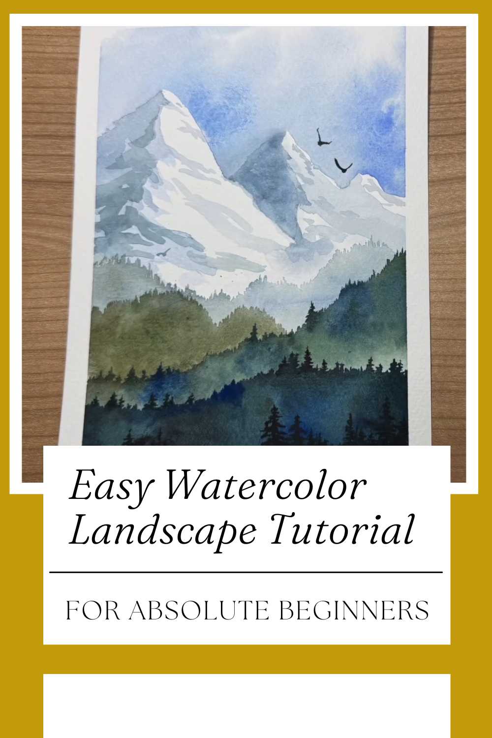
You’ll see how simple shapes become convincing mountains, and how a few brush marks can read as distant pines or birds in flight. The result is a calm alpine scene that you can adapt to any season or color story.
Materials that make learning easier
You don’t need a studio to start. A mid-weight cold-press sheet, a round brush, and a compact set of colors are enough.
The tutorial demonstrates how limited palettes—ultramarine, indigo, a warm yellow, and a natural earth—create harmony instantly.
Tape the paper to keep a crisp border and to manage buckling; that clean edge will make your painting feel gallery-ready.
Core techniques you’ll practice

Watercolor rewards patience and timing. The video walks you through essential skills while keeping things approachable for first-timers.
Wet-on-wet for skies and distance
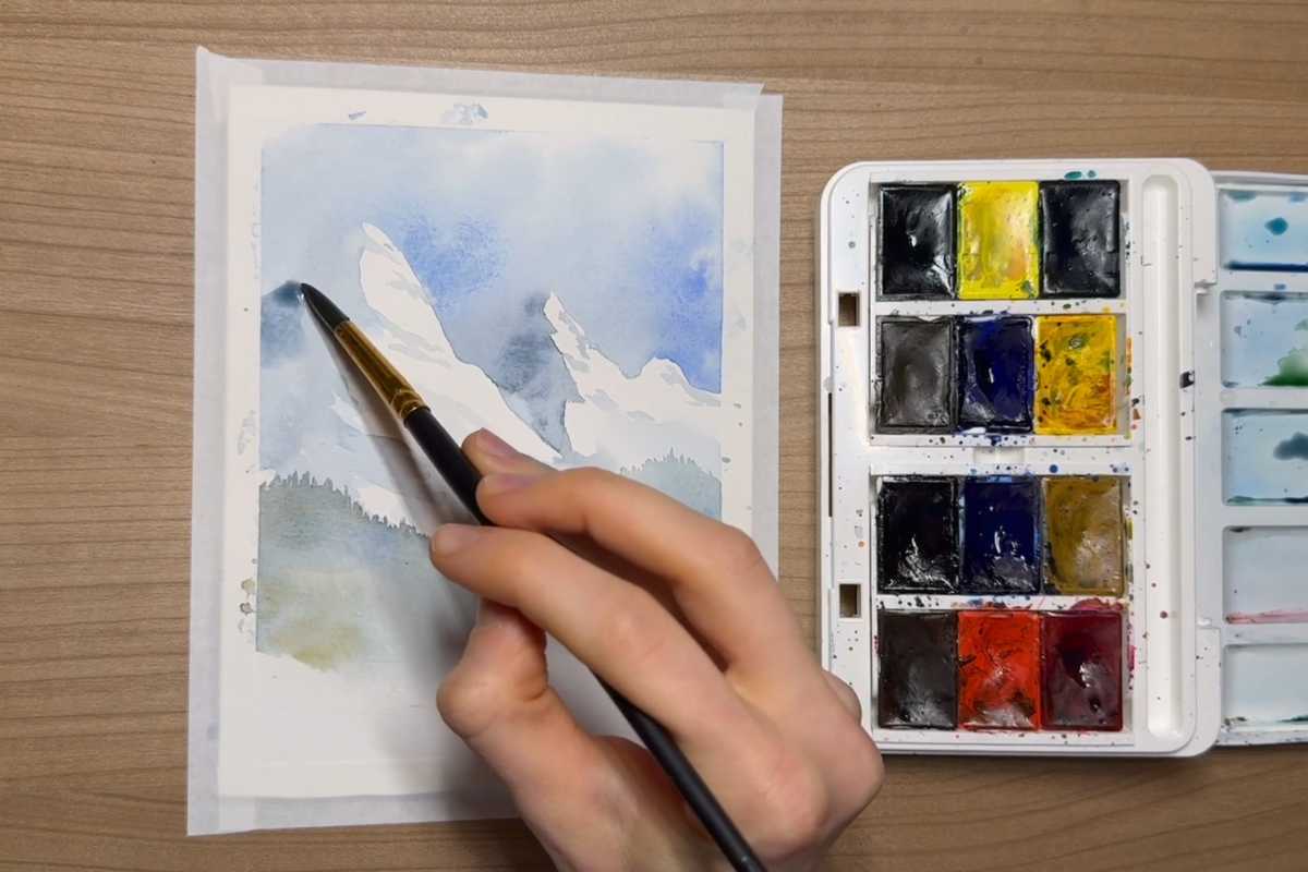
For soft skies and misty hills, the instructor uses wet-on-wet technique—laying color onto damp paper so pigments bloom and blend without hard edges.
This is perfect for atmospheric perspective, where distant forms look lighter and bluer. Letting layers dry before adding new ones preserves that depth.
Layering washes for believable mountains
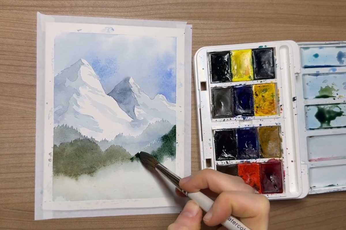
Mountains are painted in transparent, stacked washes. Each pass adds a touch of shadow and structure while keeping the forms airy.
Notice how the shapes remain simplified; you don’t need to render every rock. The power of watercolor lies in suggestion over detail, inviting the eye to complete the scene.
Negative painting for snow and highlights
Rather than painting snow directly, you’ll reserve the white of the paper and shape it by darkening the areas around it.
This negative painting approach keeps highlights luminous and natural—no opaque paint required. A few carefully placed strokes carve crisp ridgelines that feel sunlit.
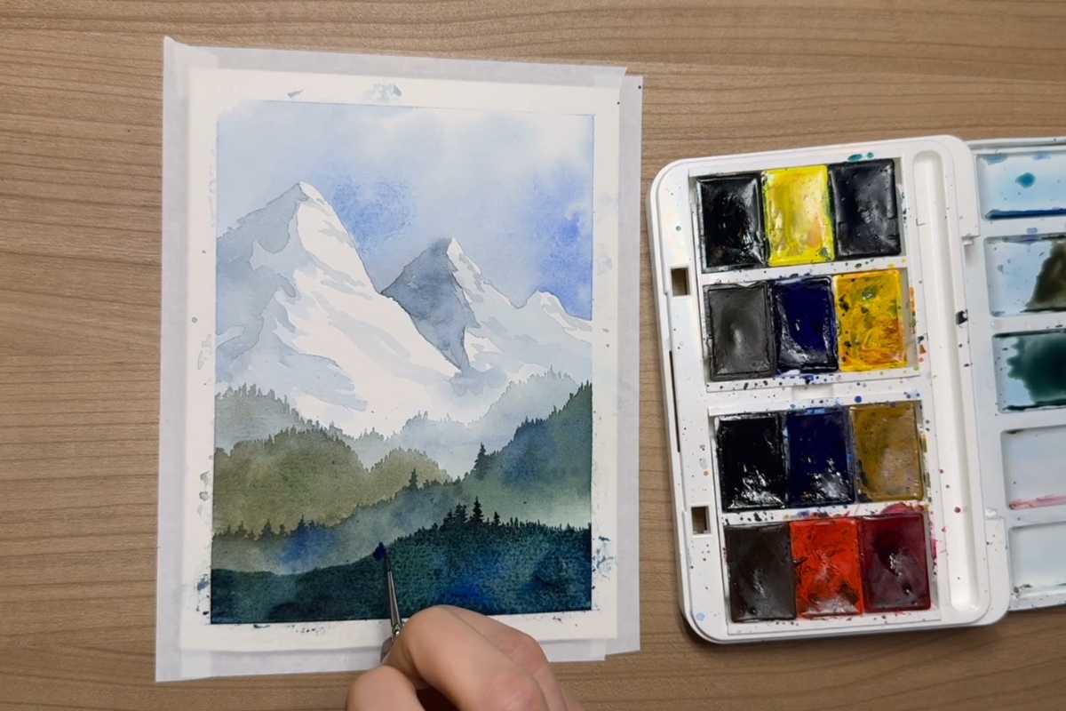
Foreground contrast for depth
To pull the scene forward, the foreground trees are placed last in deeper, more saturated tones. This value contrast against the softer background creates instant depth.
Small variations in height and spacing keep the treeline lively without fuss.
Color choices that set the mood
Even a tiny palette can sing. Cool blues and muted greens establish a tranquil, high-altitude atmosphere.
A touch of warm earth in the mid-ground prevents the painting from feeling cold, while darker cools in the foreground add drama.
Keep mixes transparent; the glow of the paper beneath gives that unmistakable watercolor luminosity.
Troubleshooting common beginner hurdles
Blooms, cauliflower textures, and unexpected edges happen to everyone. If a backrun appears, let it dry completely and glaze over it with a gentle wash to unify the area.
If shapes feel flat, increase value range—darker darks in the foreground, lighter washes in the distance.
And if colors seem muddy, mix on the paper more than in the palette, and stop before overworking; less is often more with watercolor.
Practice tips to grow faster
Paint small. Quick postcard studies let you experiment freely with composition, values, and edges. Try the same scene at sunrise and dusk to explore color temperature.
Keep a scrap of paper beside your work for test swatches; this helps you judge how wet your brush is and how your mix will dry.
About the tutorial and its author
This article complements the video tutorial created by Art In Motion. The teaching style is clear, relaxed, and focused on building confidence through simple, repeatable techniques.
You’ll see each layer unfold in real time, making it easy to follow along at your own pace.
Ready to paint?
Set up your paper, pick a limited palette, and press play. With wet-on-wet skies, layered mountain washes, and a punch of foreground contrast, you’ll finish with a serene watercolor landscape that feels fresh and expressive.
Most importantly, you’ll understand why it works—knowledge you can carry into every painting you make.
We thank Art In Motion for the images.
Enjoy The Video Tutorial

Source: Art In Motion
Did you find this post useful or inspiring? Save THIS PIN to your Art Board on Pinterest! 😊
Last update on 2025-12-25 / Affiliate links / Images from Amazon Product Advertising API
Discover More Artistic Inspiration