
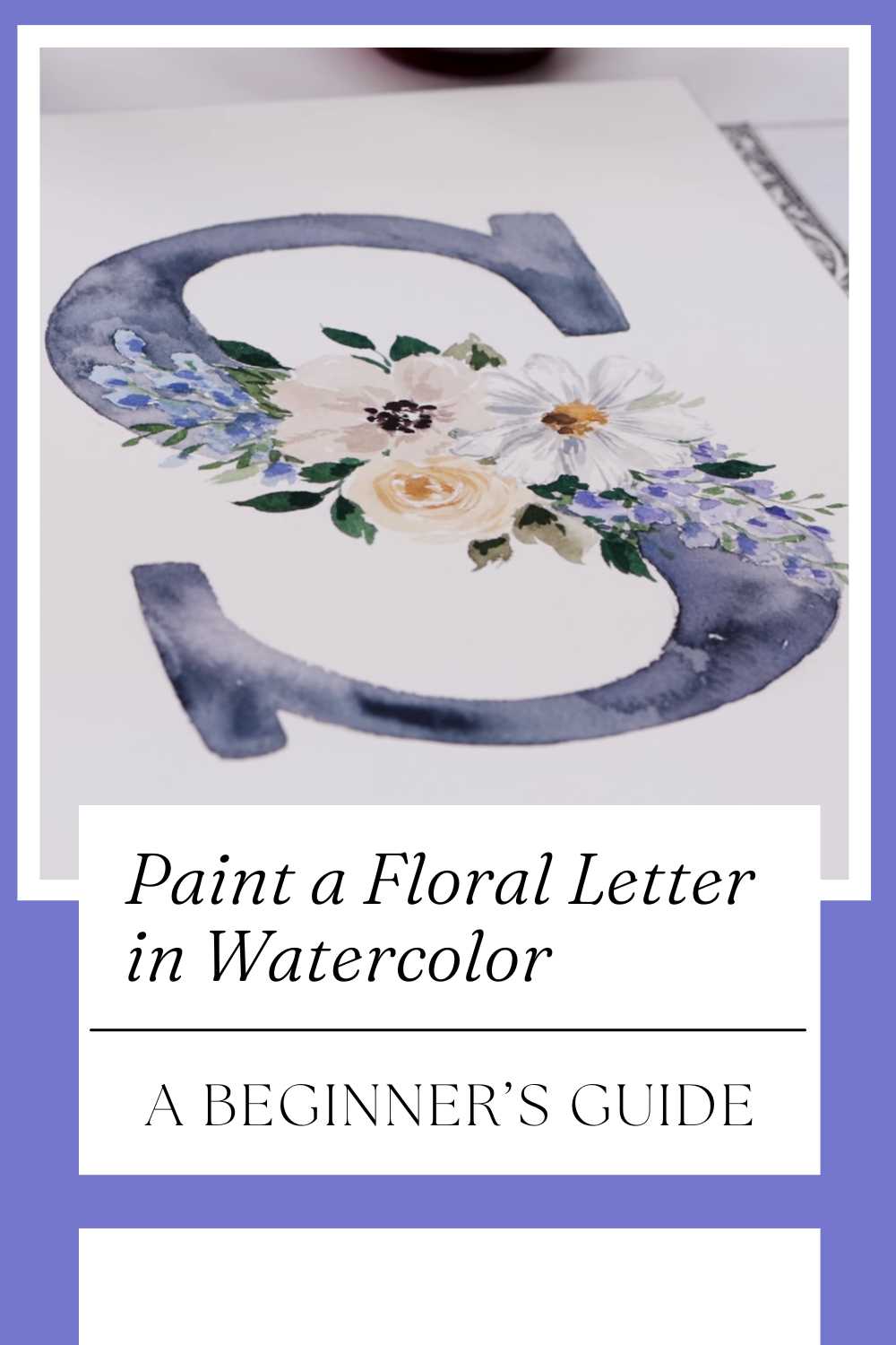
Paint a Floral Letter in Watercolor: A Beginner’s Guide
Creating a floral letter in watercolor is a beautiful way to personalize cards, gifts, or wall art without needing advanced painting skills.
In this friendly overview, we share a video tutorial by Shayda Campbell that guides beginners through transferring a letter onto watercolor paper, planning a balanced floral arrangement, mixing paints with confidence, and bringing both the flowers and letter to life.
Instead of repeating every step shown in the video, this article focuses on the creative thinking, simple techniques, and design choices that help your piece look polished and uniquely yours.
Why Floral Letters Work for Beginners
 Shayda Campbell (@shaydacampbell)
Letterforms give you a ready-made framework, so you’re never staring at a blank page. The shape acts like a gentle boundary for your blooms, helping you avoid overworking the composition.
Watercolor’s transparent layers make it easy to suggest petals and leaves with just a few strokes, while the letter underneath keeps everything cohesive.
The result is personalized artwork that feels both classic and fresh—perfect for gifting or framing.
Getting Set Up for Success
 Shayda Campbell (@shaydacampbell)
Materials That Make a Difference
Choose cold-press watercolor paper for a subtle texture that grabs pigment, a small set of student or artist-grade paints, and round brushes (one small for detail, one medium for petals and leaves).
A kneaded or soft eraser helps lighten graphite lines after you transfer your letter. Keep two water jars—one for cleaning, one for fresh water—and a paper towel for lifting paint.
Simple tools, used well, make clean edges and luminous washes much easier.
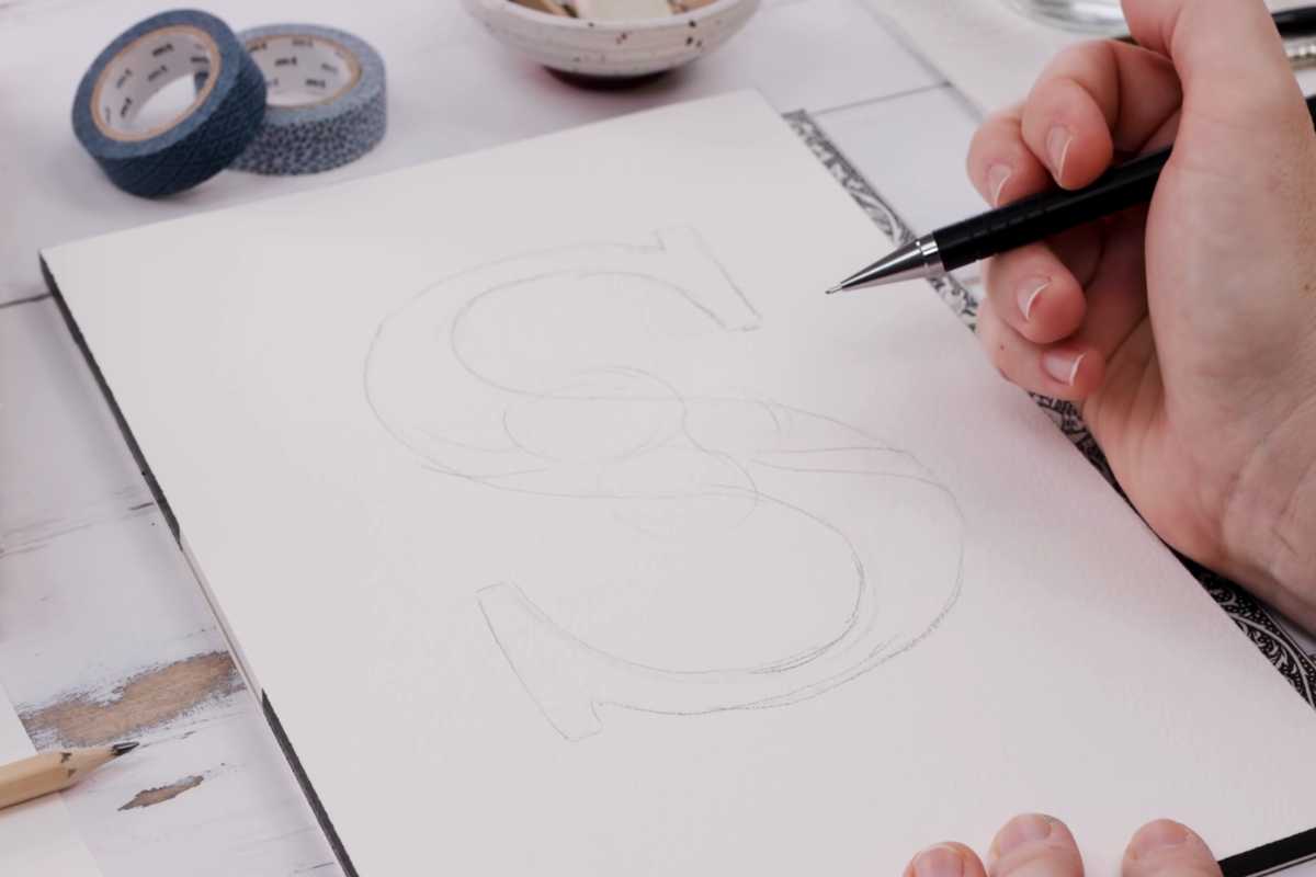
Transferring the Letter Cleanly
The video shows simple ways to get your chosen letter onto the page without harsh outlines. The key is a light, confident sketch—just enough to guide your florals.
If you press too hard, pencil grooves can trap paint. Aim for subtle guidelines you can lift later, so the letter feels integrated, not outlined.
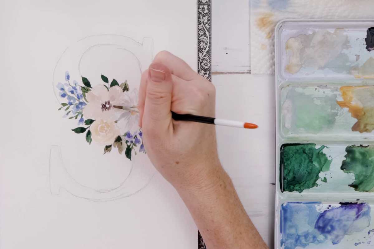
Planning Your Floral Arrangement
 Shayda Campbell (@shaydacampbell)
Balance, Rhythm, and Breathing Room
Great floral letters rely on visual rhythm. Cluster a few blooms in one area, then let negative space balance them elsewhere.
Think in triangles and clusters: one hero flower, one medium accent, and smaller supporting shapes. Vary sizes and angles to avoid a stiff look.
Leave small gaps where the paper shines through—this natural breathing room keeps your letter from feeling heavy.
Choosing a Color Story
Limited palettes create harmony. Pick one dominant hue, a companion color, and a neutral green family. For instance, coral peonies, soft mauve accents, and sage-to-olive greens.
Mix in a touch of the dominant hue when you make your greens—this subtle cross-pollination produces cohesive color across leaves and petals.
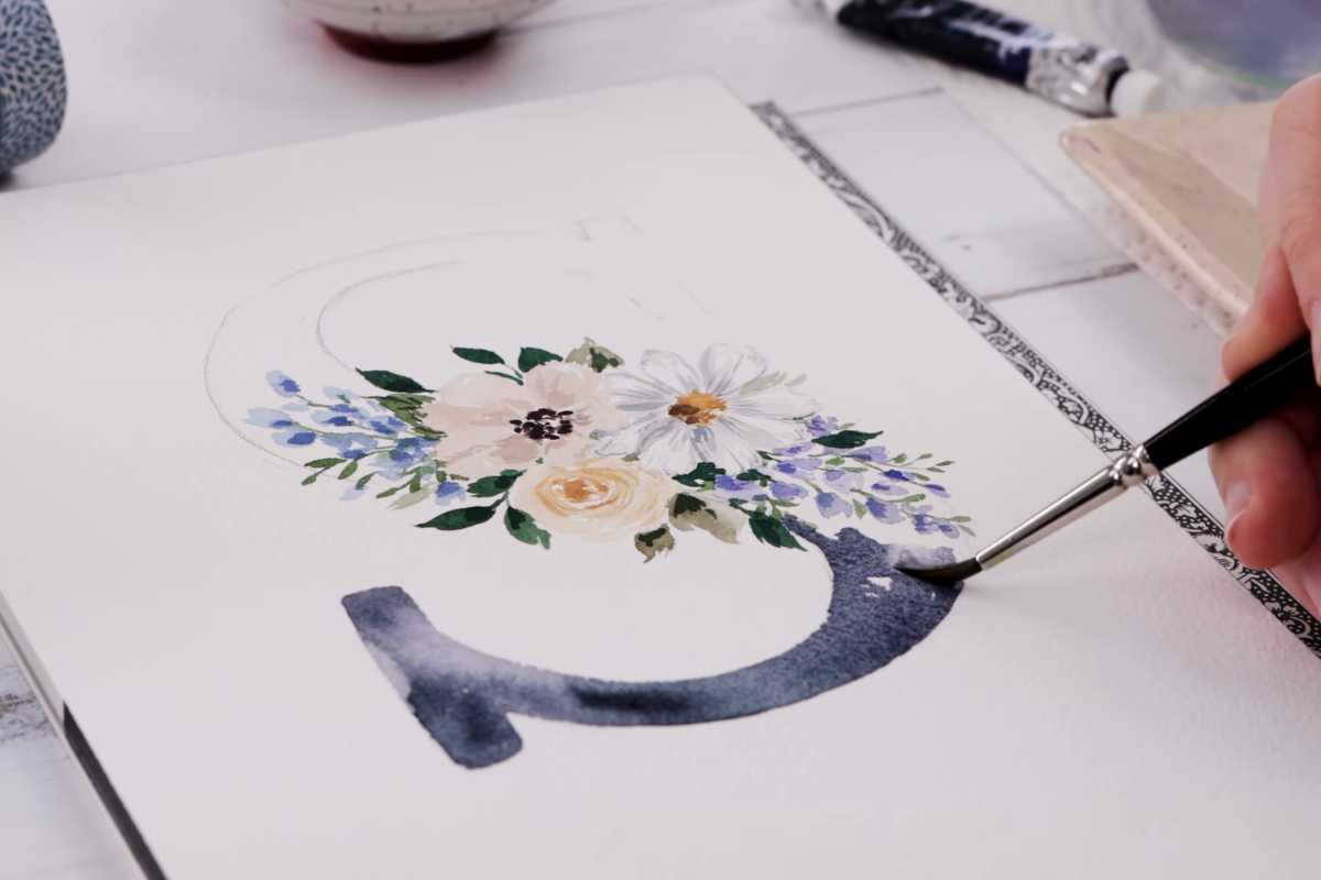
Painting Tips Without the Step-by-Step
 Shayda Campbell (@shaydacampbell)
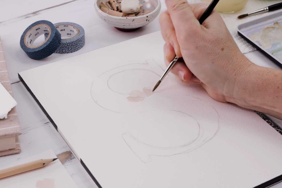
Light to Dark, Loose to Detailed
Start with light washes for petals and leaves, then layer slightly deeper tones to suggest folds, shadows, and centers.
Keep the first passes loose and translucent; save crisp edges and veins for your final touches. This light-to-dark approach preserves watercolor’s signature glow and prevents muddy mixes.
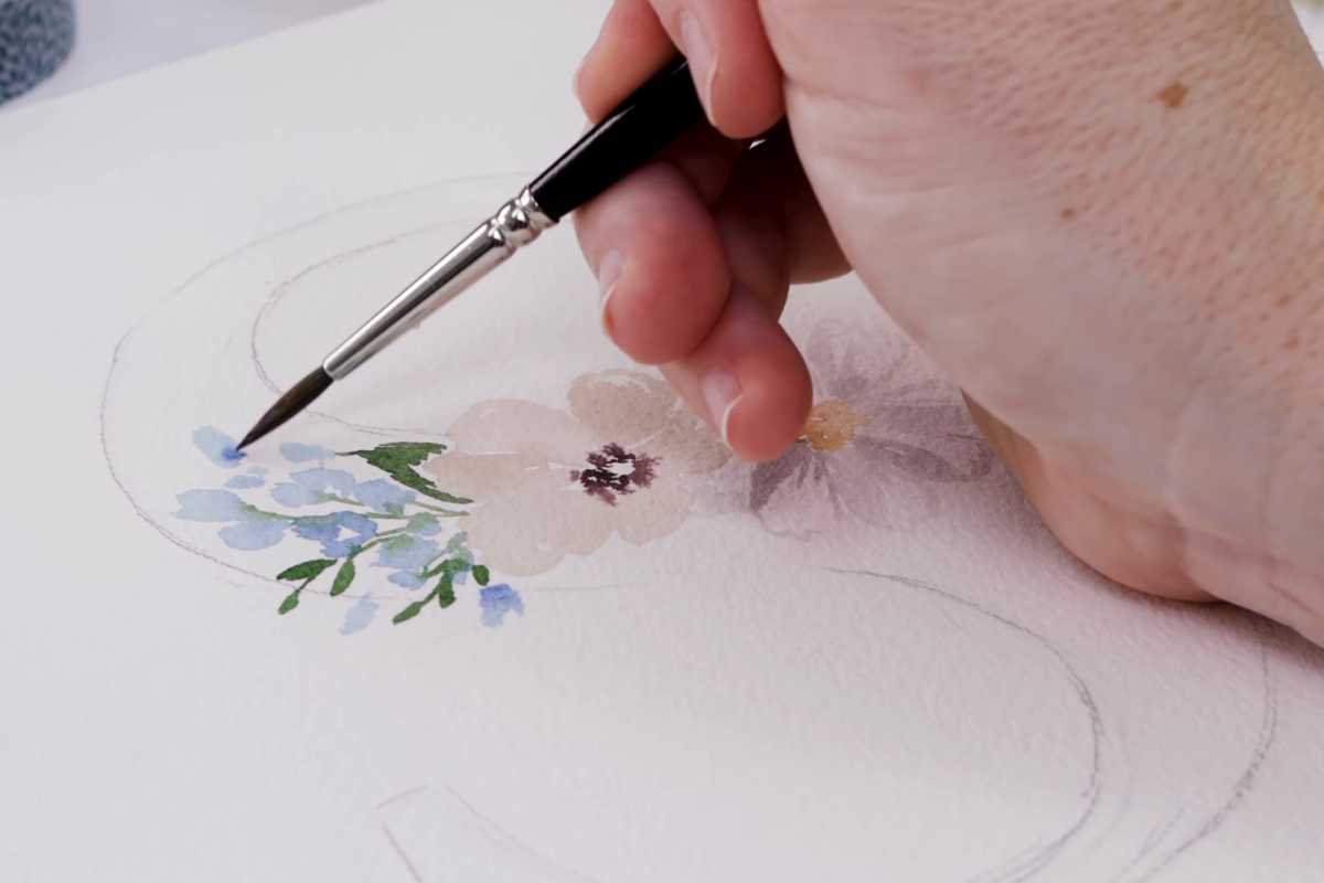
Soft Edges vs. Crisp Edges
Use damp-on-damp for soft petal transitions and damp-on-dry for sharp details.
When two petals meet, a soft boundary feels natural; for leaf tips or a letter’s sharp corner, a crisper stroke adds clarity. Purposeful contrast—soft here, crisp there—creates depth.
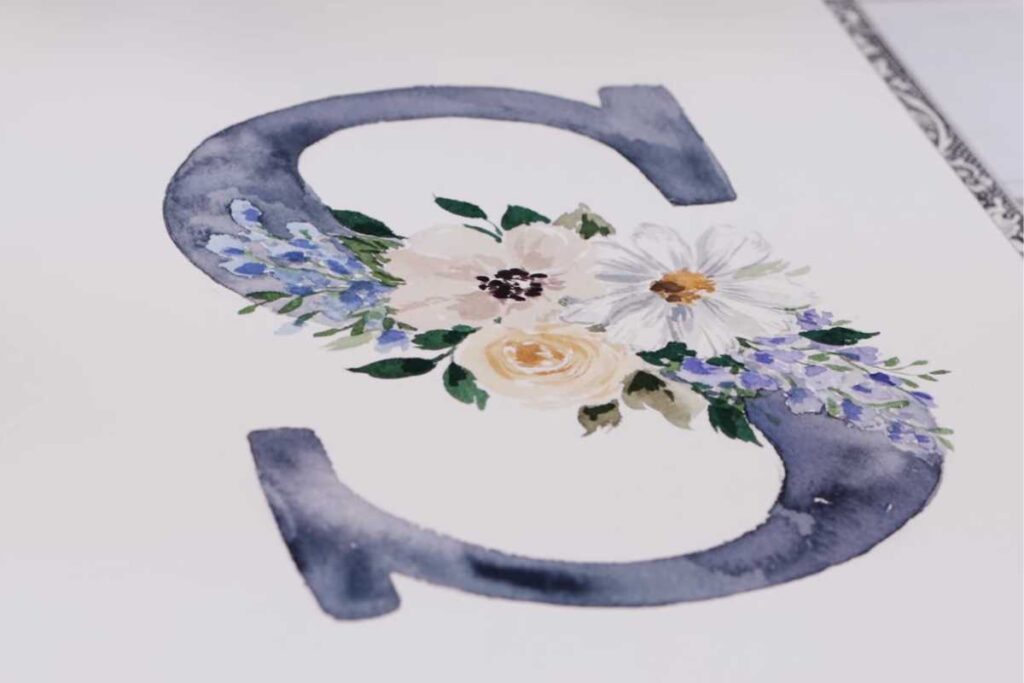
Keeping the Letter Readable
Let clusters of flowers skim the letter’s outline without burying it. Strategic gaps along edges hint at the form beneath.
If you need clarity, paint a thin, transparent shadow along the inside of the letter’s strokes. This keeps the form legible while maintaining a light, painterly finish.
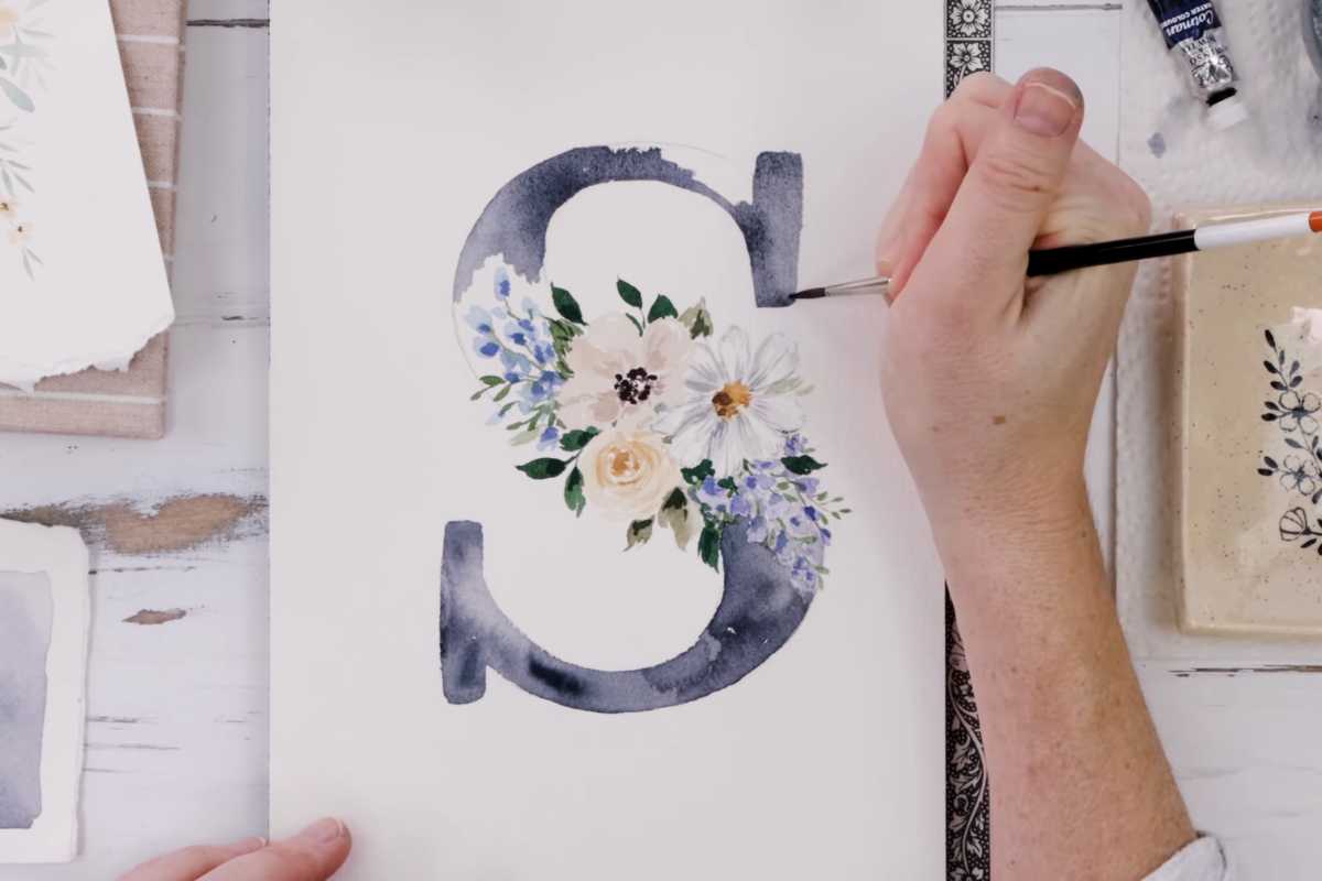
Variations, Personalization & Finishing
 Shayda Campbell (@shaydacampbell)
Make It Yours
Swap blooms by season (spring anemones, summer roses, autumn mums), or tailor colors to a wedding palette or nursery theme.
Add a minimal ink monogram beneath the piece, or mount the artwork with a clean white mat to elevate the presentation.
Final Polish
Lift a few highlights with a damp brush and paper towel to revive sparkle in petals. Erase any remaining graphite lightly once everything is bone-dry. Sign discreetly.
The final effect should feel fresh, airy, and cohesive, with the letter quietly anchoring your florals.
Watch and Learn
 Shayda Campbell (@shaydacampbell)
To see these ideas in action, watch the beginner-friendly video tutorial by Shayda Campbell.
You’ll find clear guidance on transferring the letter, planning the arrangement, mixing paints, and painting florals with confidence—perfect for anyone eager to create beautiful, personalized watercolor art without feeling overwhelmed.
We thank Shayda Campbell for the images.
Enjoy The Video Tutorial

Source: Shayda Campbell
Did you find this post useful or inspiring? Save THIS PIN to your Art Board on Pinterest! 😊
Last update on 2025-12-25 / Affiliate links / Images from Amazon Product Advertising API
Discover More Artistic Inspiration