The Secret to Striking Watercolor Botanicals with a Vintage Twist

Watercolor painting is often associated with soft tones and delicate blends, but there’s a striking alternative that’s gaining popularity among artists: dark watercolor florals.
By reversing the usual approach — placing light botanical elements against a bold, black background — you unlock a look that’s dramatic, vintage-inspired, and impossible to ignore.
This technique transforms traditional floral illustration into something far more eye-catching. It’s not just about aesthetics; it’s about contrast, balance, and creative control.
A Vintage Feel with a Modern Edge
There’s something timeless about botanical illustration. But when paired with a deep, matte black background, it steps into a new light — one that feels almost Victorian, gothic, and editorial all at once. It’s both nostalgic and fresh.
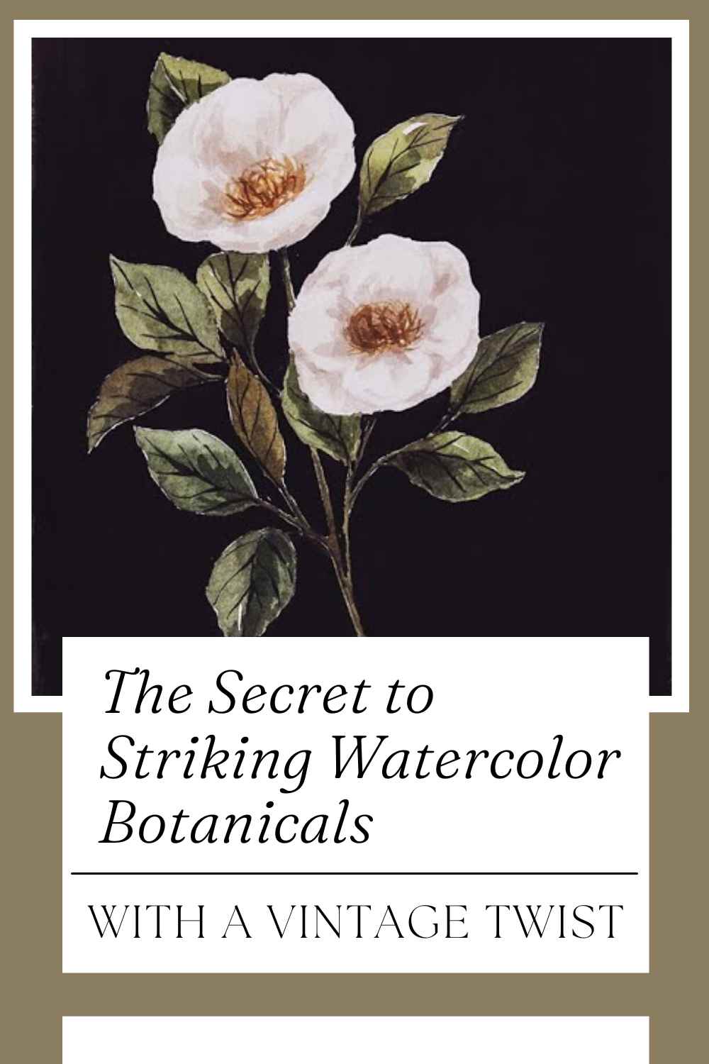
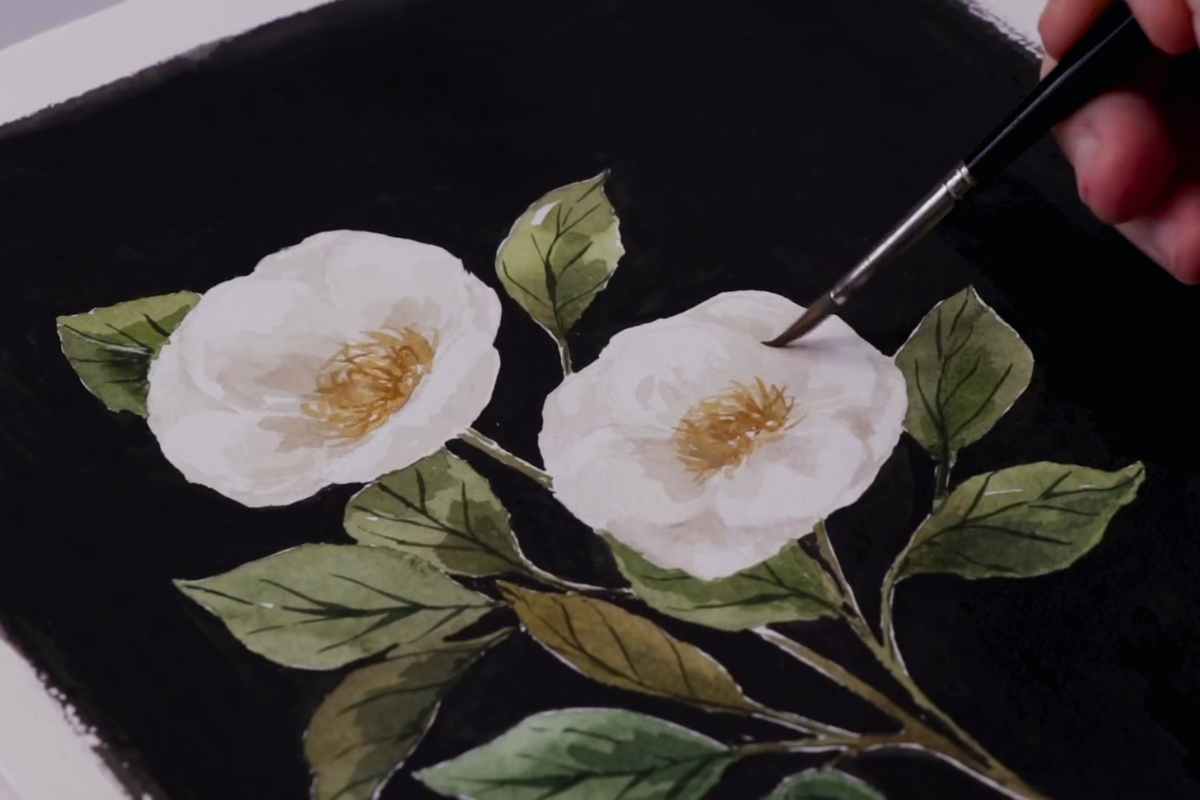
The white flowers in this piece stand out not just for their simplicity but because of how the dark background frames them. Shadows deepen, greens become richer, and every detail in the petals takes center stage.
Why the Black Background Works
The secret behind the impact of this painting is contrast. Watercolor is naturally translucent, and that can sometimes make pale or white elements disappear on the page. But with a dark base, even the most delicate bloom becomes vivid.
This method forces the eye to focus on the shapes, textures, and linework of the subject. It also creates an instant sense of depth — no complex shading needed. The background does the heavy lifting.
A Simple Shift, A Big Impact
The technique isn’t complex. In fact, the beauty of it lies in its simplicity. Instead of building up layers of color around the florals, the negative space becomes part of the design. It’s a clever way to make your painting stand out without overcomplicating it.
This trick also provides a sense of cohesion. The dark background acts almost like a picture frame, pulling everything together and making the painting feel complete — even when the subject is just a single flower.
The Mood of the Painting
While soft pastels convey freshness and lightness, dark florals introduce a more moody and sophisticated tone.
They suggest introspection, elegance, and a bit of mystery. Think of antique book covers, botanical encyclopedias, or vintage wallpaper — all wrapped into one watercolor page.
This vibe is what makes the approach so appealing to artists who want to break from traditional watercolor themes. It allows you to explore not just color theory, but emotion and atmosphere.
Ideal for Journals, Prints, and Framing
This style isn’t just beautiful — it’s versatile. The contrast makes it a perfect candidate for scanning and turning into prints, greeting cards, or wall art. It also works well in sketchbooks and art journals, offering a bold visual break from lighter pages.
Even a small piece, like the one shown, feels polished and intentional. And because of the minimal color palette, it complements almost any interior style if framed.
Learn the Technique
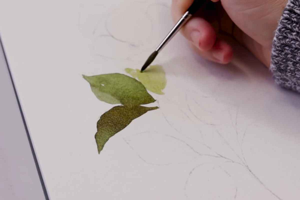
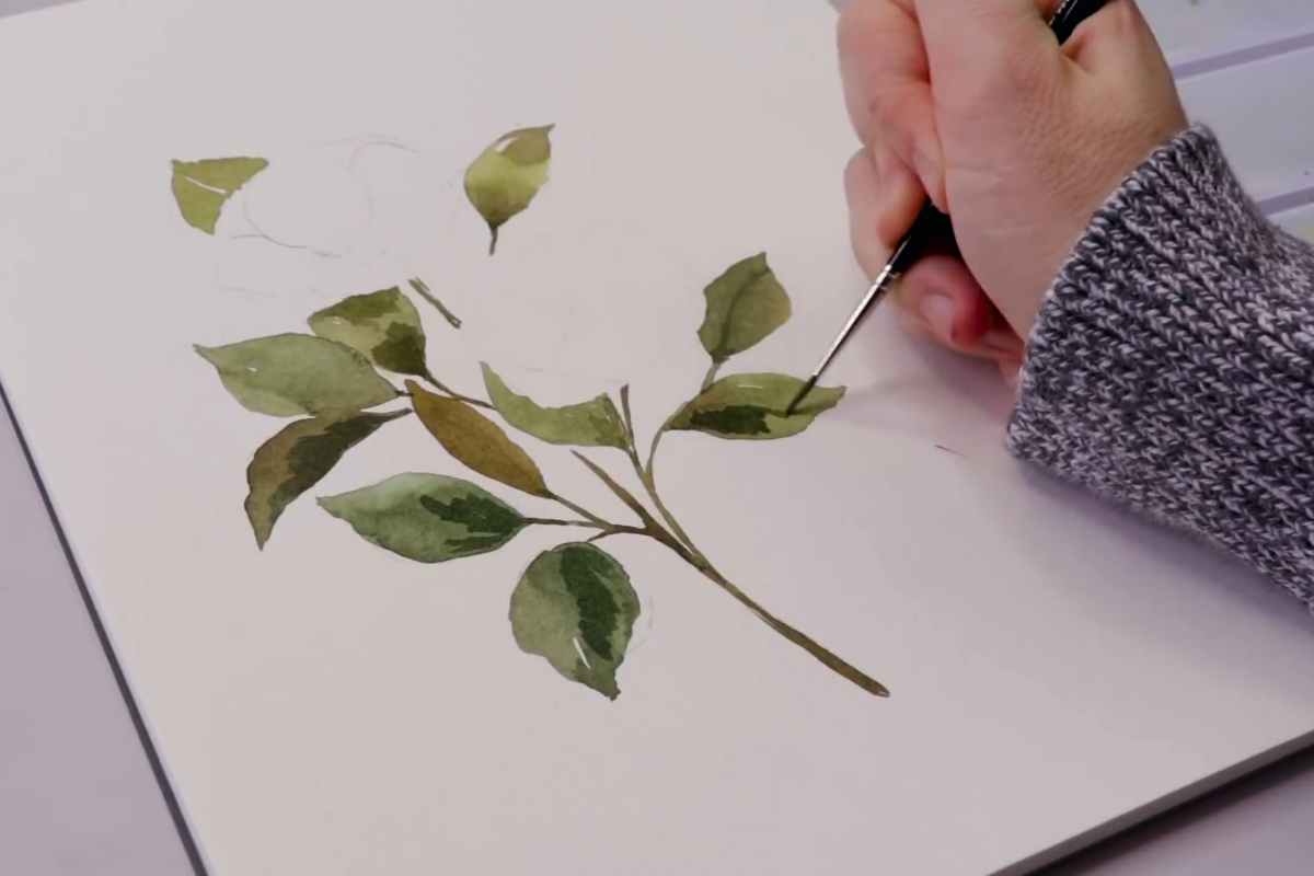
If you want to see how this was painted from start to finish, the video tutorial lays it out clearly. From background prep to fine botanical detailing, the steps are approachable whether you’re a beginner or more experienced with watercolor.
Final Thoughts
Dark watercolor florals offer an easy but effective way to elevate botanical painting. With one simple shift — using a black background — you can add drama, depth, and elegance to your work.
It’s proof that sometimes, going darker brings more light to the subject.
If you’re ready to give your botanicals a fresh look, this is a style worth exploring. Clean. Bold. Timeless.
We thank Shayda Campbell for the images.
Enjoy The Video Tutorial

Source: Shayda Campbell
Did you find this post useful or inspiring? Save THIS PIN to your Art Board on Pinterest! 😊

Last update on 2025-06-26 / Affiliate links / Images from Amazon Product Advertising API


Discover More Artistic Inspiration